
Designed to Disappear.
NOTHING BETWEEN YOU AND REALITY. -
Modular Virtual Reality Headset
Duration : June 2024 - August 2024
(passion project and is in no way affiliated with Nothing©)
This VR headset concept was created as a design study to better understand how brand identity informs product design. Inspired by Nothing’s design language of clarity, transparency, and restraint, the project explores how these values can shape form, detail, and user experience. It also serves as a focused exercise in CMF design, examining how color, material, and finish choices communicate a brand’s essence through physical design.

01 Research
Design Language & CMF Insights — Inspired by Nothing

Nothing’s design approach focuses on radical simplicity—clean surfaces, clear typography, and minimal visual noise. My research examines how this restraint communicates confidence and purity of form. For my VR headset, I aim to apply that same clarity—refining each component until it feels inevitable rather than decorative.
Nothing designs tech that blends naturally into daily life. I’m studying how their ergonomic decisions, materials, and interaction points achieve this balance. Translating that into a headset means emphasizing comfort, soft geometry, and intuitive use so the technology fades behind the experience.

Consistency defines Nothing’s identity—shared materials, dot motifs, and transparency tie all their products together. My CMF research explores how to echo this system through my headset’s finishes, modular parts, and restrained branding, ensuring it feels like part of a unified design language.
02 Mood Board
CMF Research


GOAL
Develop a VR headset that captures Nothing’s philosophy of clarity, transparency, and minimalism while balancing the ergonomic and technical demands of immersive design.
03 Exploration
I explored different concepts via sketching.

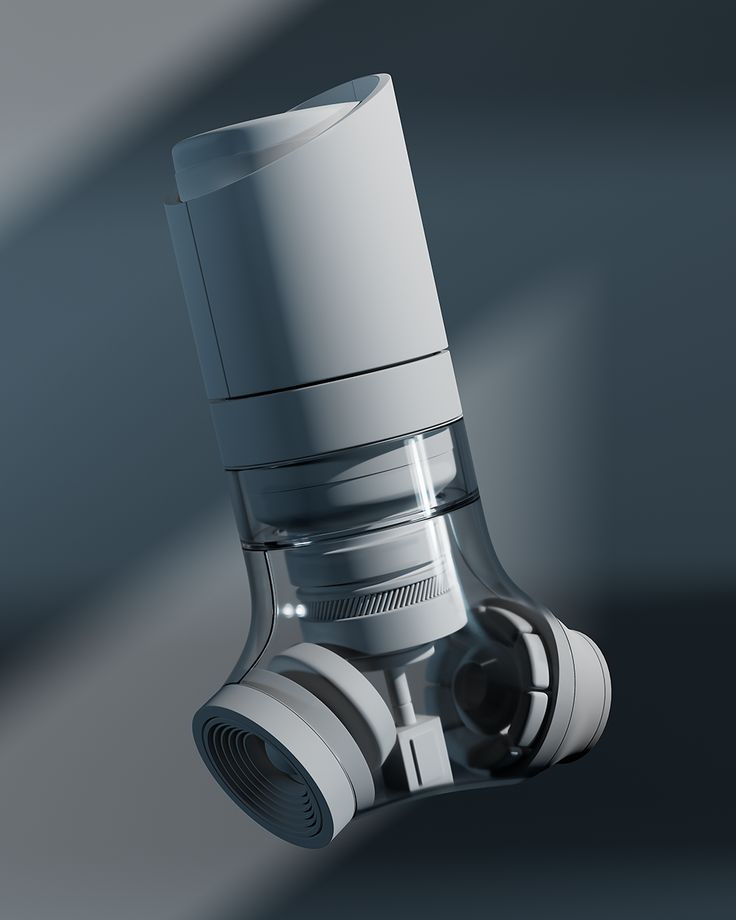
04 Final Design

Less design. More experience.
This product embodies the challenge of translating Nothing’s “less than nothing” philosophy into a form defined by ergonomics and function. While a VR headset demands structure, comfort, and precision fit, the design strives to maintain the brand’s essence of transparency, clarity, and refined simplicity. It represents a balance between brand expression and human-centered design, where every surface, connection, and material choice reflects Nothing’s pursuit of purity while adapting to a product that, by nature, cannot disappear.
WHY NOTHING?
The essence of Nothing, reimagined in VR.


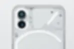
SIGNATURE "GLYPH" TRADEMARK
The VR goggles integrate the signature Glyph as both a functional interface and a brand statement inspired by Nothing’s design language. The illuminated, minimal line-work acts as a non-intrusive status layer—communicating pairing, battery, and capture states with at-a-glance light patterns—while doubling as a distinctive visual identity that’s recognizable even off. By embedding the Glyph into the frame and strap geometry, the goggles keep surfaces clean and distraction-free, reduce on-device text and icons, and create a consistent interaction language across accessories.

BRAND DESIGN LANGUAGE
These VR goggles were designed by following Nothing’s core design language: radical simplicity, honest construction, and ambient communication. Nothing’s products highlight transparency (show the build), reduction (remove visual noise), and light as interface (the Glyph as clear, unobtrusive feedback). Translating that, The form restrained, let structure read clearly, and used a Glyph-style light signature for status—so information is visible without shouting. The goal was a headset that feels open, legible, and brand-coherent: less decoration, more clarity, and an identity you recognize at a glance.


